MargicSurvey
An new AI research assistant for fast, source-backed internal knowledge retrieval, improving retention by +15% and MAU by +18%.


UX Design Intern
Product Design, Visual Design, User Research
2024/11-2025/1
2 months
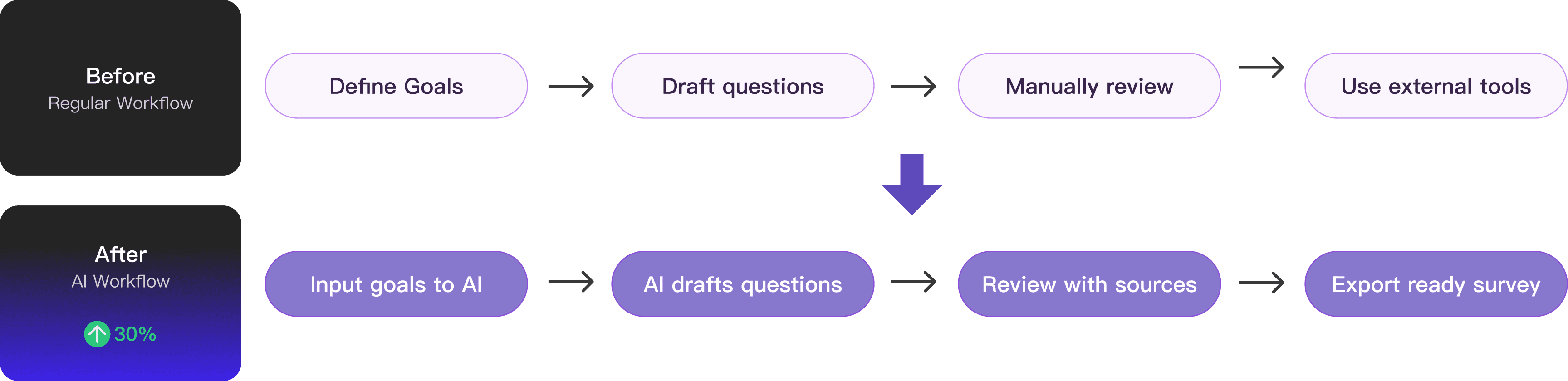
What I have done
Home Page
An interactive home page for guided and precise insight discovery.
Answer Page
A clear insight flow with transparent, verifiable sources.
Design Goal
Create a unified AI that consolidates internal research knowledge, making insights proactively accessible, understandable, and trustworthy.
Target Users
Collaborated with PM, I set 240 surveys and found out users don’t lack tools — they lack clarity, trust, and integration.

PMs & Researchers
Age: 20–40 years old
Traits: Analytical, Efficiency-focused.
Users start with vague goals, not workflows
“I want to understand users better, but I don’t know where to start.”
Users don’t trust AI without context
“I don’t know where this answer is coming from.”
Users start with vague goals, not workflows
“I still use ChatGPT / other tools instead.”
Competitive Research
I also conduct a research including 4 AI tools to understand how AI can guide users, establish trust, and integrate into workflows.

Insights:
Experience Goals:
Simplify information discovery, build trust in AI-generated insights, and support seamless research workflows.

Reduce cognitive load
Users often begin with vague goals and face blank states. The goal was to guide them step by step, reducing friction and simplifying decisions.

Build trust and confidence
AI outputs can feel unpredictable. The goal was to make the system transparent and controllable so users feel confident using it.
Enhance research workflows
Surveys support broader research efforts. The goal was to ensure outputs are structured, actionable, and ready to use in real workflows.
Business Goals:
Expand adoption of MagicSurvey, increase active usage, and strengthen its unique value.

Attract new users
Position the AI feature as a compelling entry point that lowers the barrier to survey creation and draws in first-time users.

Boost MAU
Encourage repeat usage by making survey creation faster, clearer, and integrated into ongoing workflows.

Drive differentiation
Offer capabilities that go beyond template-based tools, positioning the product as a smarter, AI-native solution.
Feature 01: Dynamic Entry to Highlight the New Q&A
A dynamic icon distinguishes the new entry, with hover revealing a brief explanation. Also I designed a top banner to promotes the feature to increase visibility and click-through rates.
After the team review, I found the new Q&A function was fundamentally different from existing features. So I designed this distinct entry that opens to a separate page, keeping it set apart from the current information structure while highlighting its uniqueness.


Feature 02: Recommendation Cards to Guide AI Exploration
Recommendation cards surface suggested questions upfront, helping users quickly explore AI capabilities, structure their research, and reduce cognitive load when starting a survey.

Keeps the input frame at the bottom for consistency.
Shifts visual focus to the recommendation cards, weakening the input frame’s hierarchy.

Larger card exposure makes them easier to notice.
Less engaging than the collapsed version and less memorable for new users.
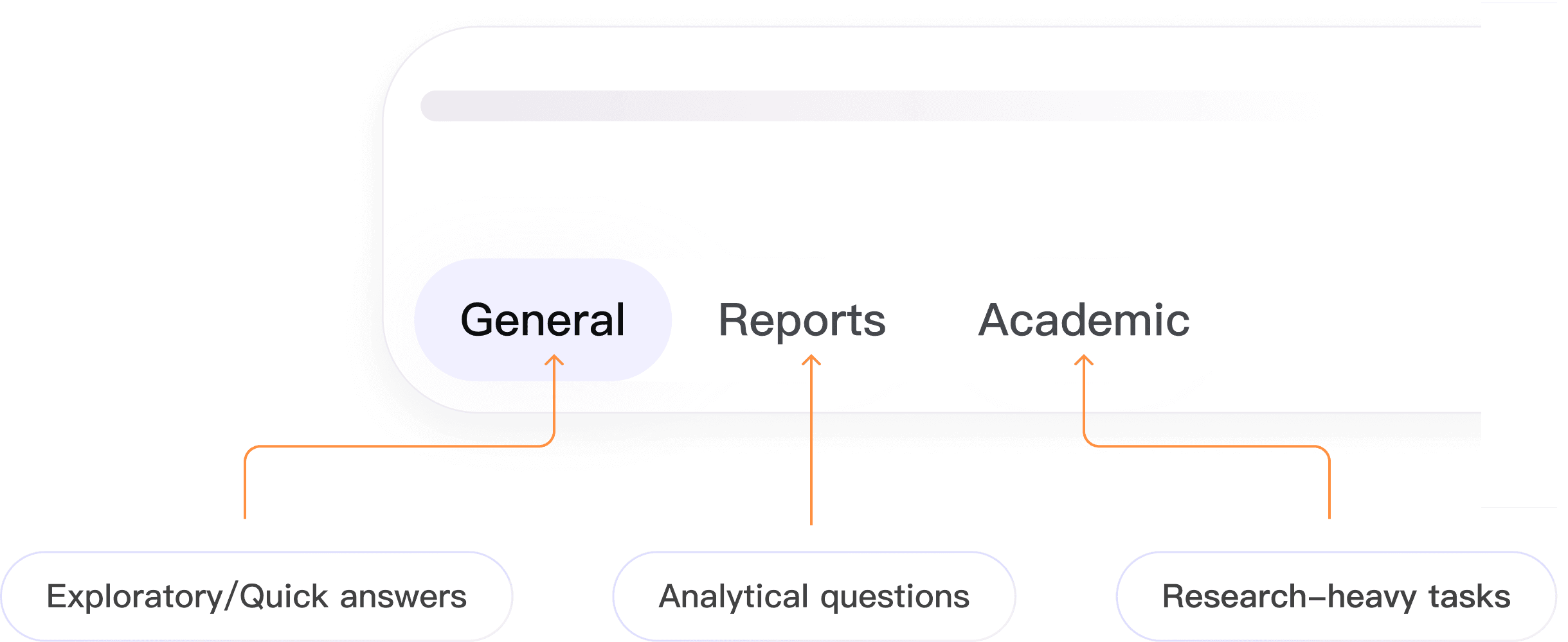
Feature 03: Mode-Specific Guidance for Effective Q&A
By providing different modes, the input frame guides users to ask questions in the right context, and makes AI proactively usable across different research scenarios.
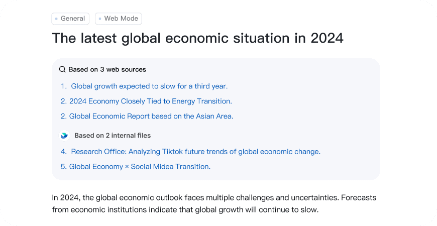
Feature 04: Clear Separation of Sources to Build Trust
By separating internal (Lark) and external sources, the feature increases transparency, builds confidence in AI responses, and helps users decide which insights are more reliable.

Overly dense for quick comparison
Weaker visual hierarchy and engagement

Sources are mixed, reducing clarity
Harder to judge credibility
Driving Execution
When vendor constraints affected development quality, I led QA, creating annotated comparisons and collaborating with engineering to ensure design intent.

This was my first close collaboration with SDEs, where I learned that simple design details can be technically complex. It reinforced the importance of engineering alignment and rigorous QA to deliver a polished UI.
Impact
Being a Proactive Learner
It's common to design for a product you've never used, or a field you're not familiar with. Always stay curious and proactive in learning to prepare for new knowledge.
While communicating with people who think differently than you do, always listen carefully to understand, and speak boldly to contribute your perspective.
↓ Photos with my amazing team — grateful for them all.
