Hero Screen - Discovery Flow
HUD Track - Plug and Play Experience
An engaging and informative setting up process.

Magnetic, Minimal, Odular
I create a sub-design system that conveys a magnetic visual language. Also explored the logo of the platform that aligns with this identity.

Design Iteration
I made iteration based on client feedback & team review, shaping a more engaging experience.
Platform Home Page
Before

Device management area takes up excess space.
Product detail section feels overly crowded.
After

Use a navigation bar to switch easily between devices.
Free up space for visual interaction and product details.
Downloading Process
Before

Current installation flow isn’t visually striking.
Downloading process lacks engagement.
After

Increase visual contrast to be more immersive.
Switch to manual playback to reduce idle time.
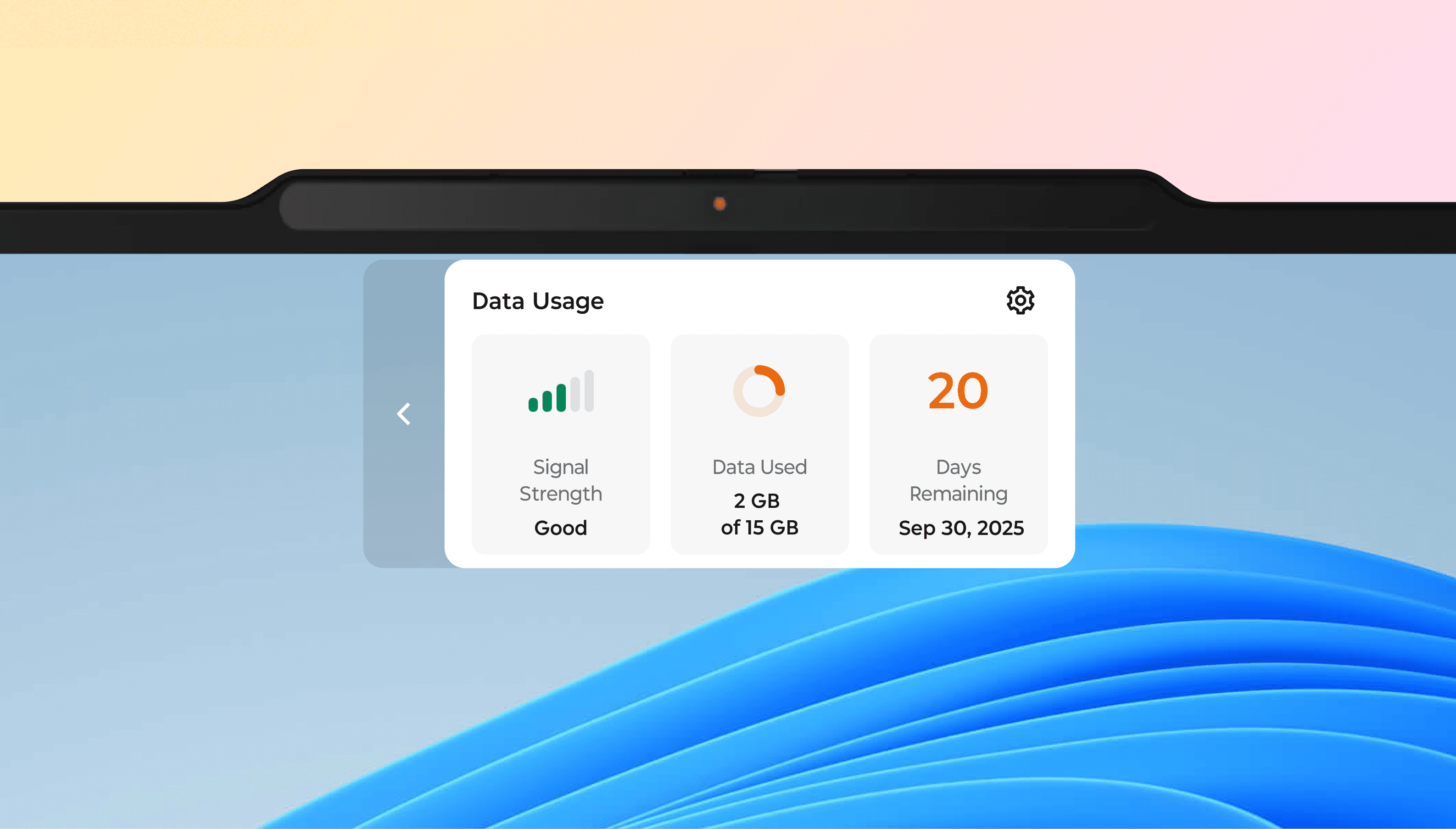
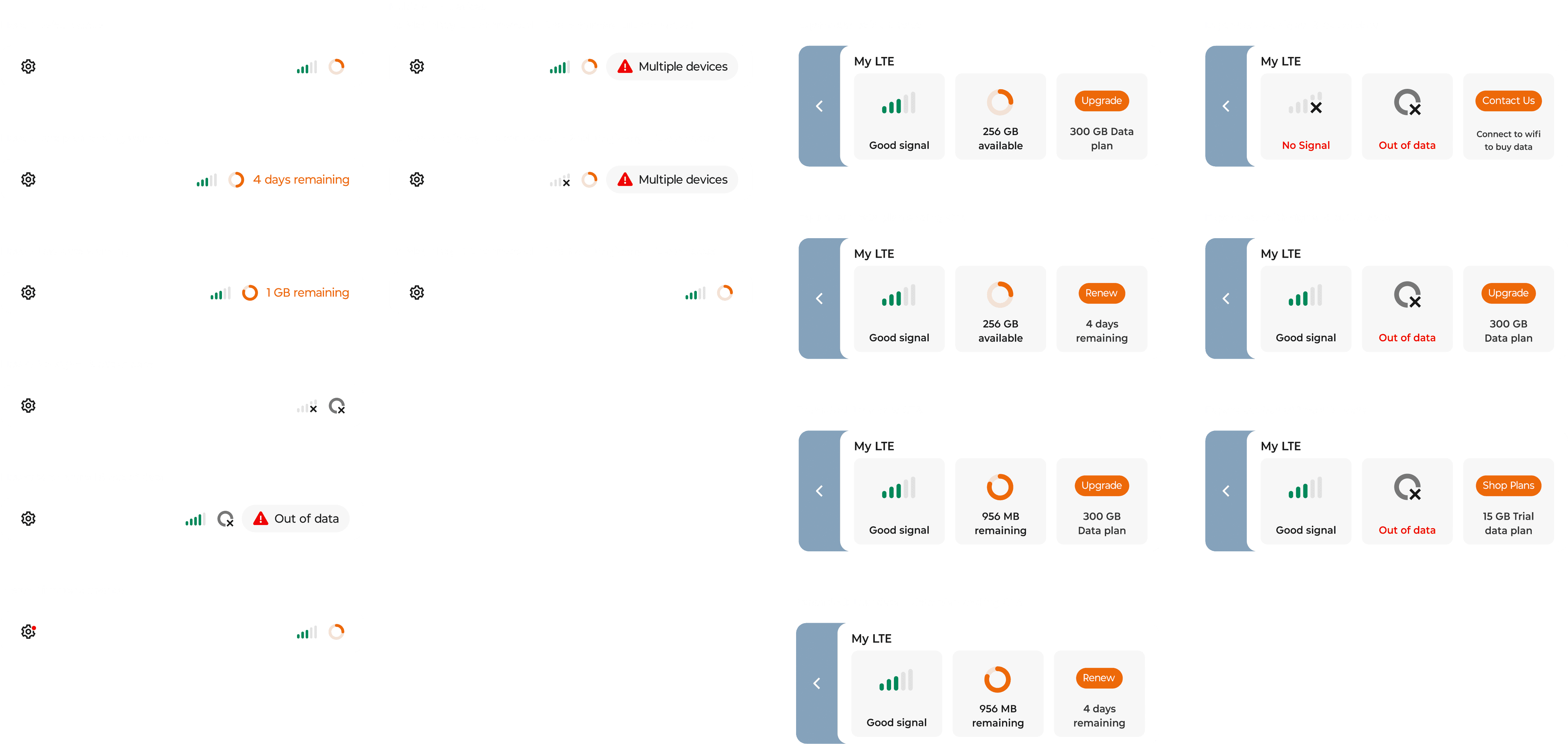
Connection Point
There are many thinking processes behind this part. If you want to view more details, please click
Before

Insufficient information displayed.

Add CTA to simplify data renewal.
Display more information related to data.
System Design
I made iteration based on client feedback & team review, shaping a more engaging experience.
PRD Review & Road Map
To define a navigation hierarchy, we organized the PRD into a high-end flow from purchase to daily use, and highlighting the hero moments.

Other processes
I also completed several other steps to define a clear design direction, including IA, personas, and user journey mapping.
Hi-Fidelity UI
I led the design and refinement of the final UI, ensuring consistent branding and visual identity.
If I have more time
Share technical limitations early with the client team to prevent later design issues.
Conduct usability testing with real users to gather data to refine the design.
I learned
How to better balance business goals with a seamless, user-friendly experience.
Adapt quickly to complex projects and the fast team pace.