Discovery Hub
Led 0→1 design for Lenovo’s Discovery Hub, creating a scalable app discovery and engagement system validated with up to 3.5× higher CTR across 1M+ users.
UIUX Design Intern
UIUX Design, Usability Testing
UX Designers,
Product Managers,
Software Engineers
2025/6-2025/7
6 weeks
What I have done

Context
A six-week sprint to design Lenovo's first dedicated discovery experience for both new and returning users.
Embedded with Punchcut on Lenovo's SMB team, I joined a project aimed at moving past first-launch onboarding toward continuous discovery — adopting the One Lenovo design system as the foundation.
Current problem
Lenovo's current software hides its best apps behind a settings-style interface.

User Journey
In order to ground the design decisions, I mapped how two users move through the Hub.
From the user flows, three moments stood out.
These moments stood out as the ones that would decide whether Discovery Hub got used at all. The next three sections focus on each.
Moment 01
First contact
How to encourage users to enter a hub they didn't know existed?
Moment 02
Coming back
How can we better boost re-engagement after the first visit?
Moment 03
Staying inside.
How to make both new and returning users engage in the hub page?
Moment 01
First contact
How to encourage users to enter a hub they didn't know existed?
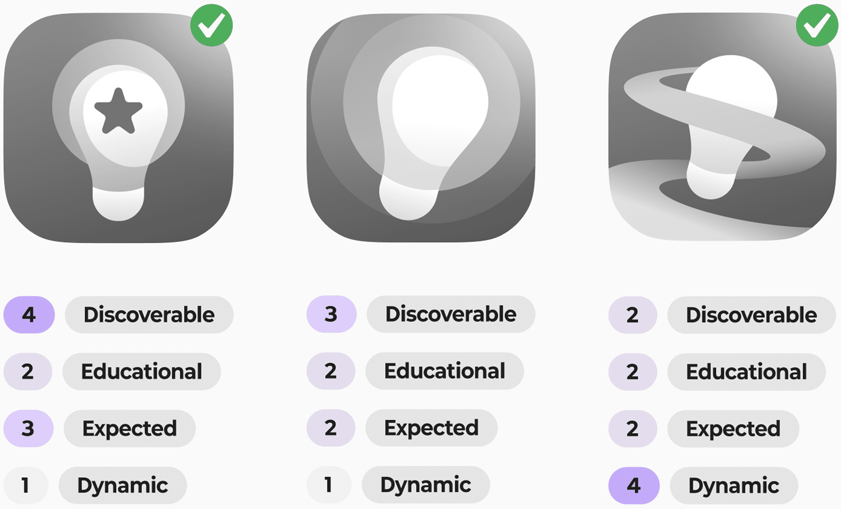
I tested on what does "discovery" look like.
Working with the research team, I conducted usability testing on 3 icon directions against four criteria — discoverable, educational, expected, dynamic.
Round 1

Round 2
I explored how the first impression can be better communicated.
I explored how the splash could balance product identity and ecosystem value, positioning Discovery Hub as more than just a utility app.
Round 1

Round 2
Felt promotional, not functional
Round 3 (Final)
The soluion
Dynamic icon in the bottom bar as main entry+ Handshake moment
Moment 02
Coming back
How do we bring users back after the first visit?
I collaborate and wireframe a prototype, in order to test the flow with real users.
Together we shaped Jane's journey — from the contextual pop-up mid-game, to the post-use recap, to learning the feature on her own — so we could put it in front of users and see what actually held up.

I validated the language and contents with 2 rounds of testing.
I conducted 2 rounds of usability testings to test out how to encourage user have stronger desire to click the pop-up.


Takeaway
Personalized data + action verb beat generic feature description, every time.
I also organize the pop-up logic to earn the user's attention instead of wearing it out.
The pop-up nudges once, retries if dismissed, confirms the value after activation — then stops.
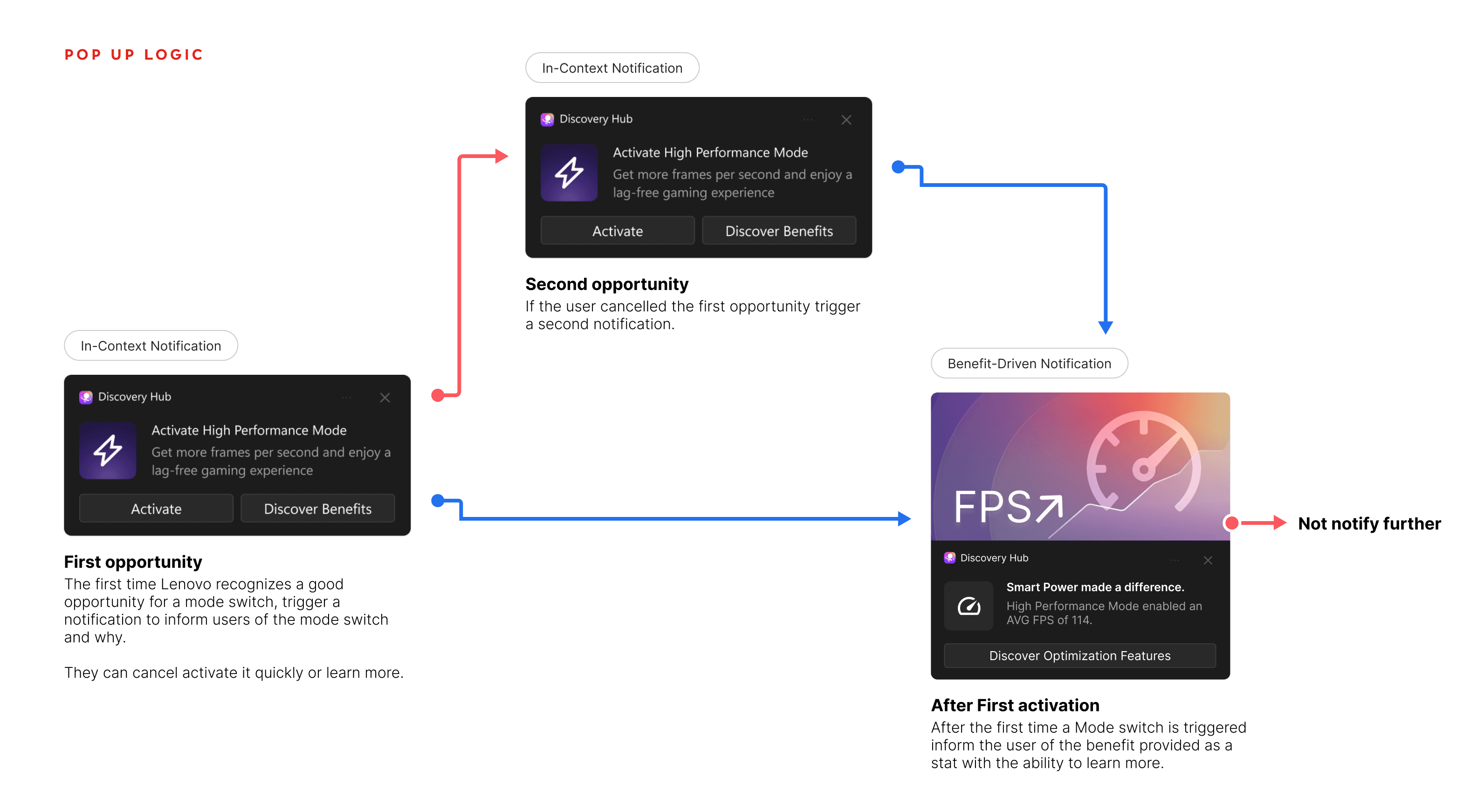
The soluion
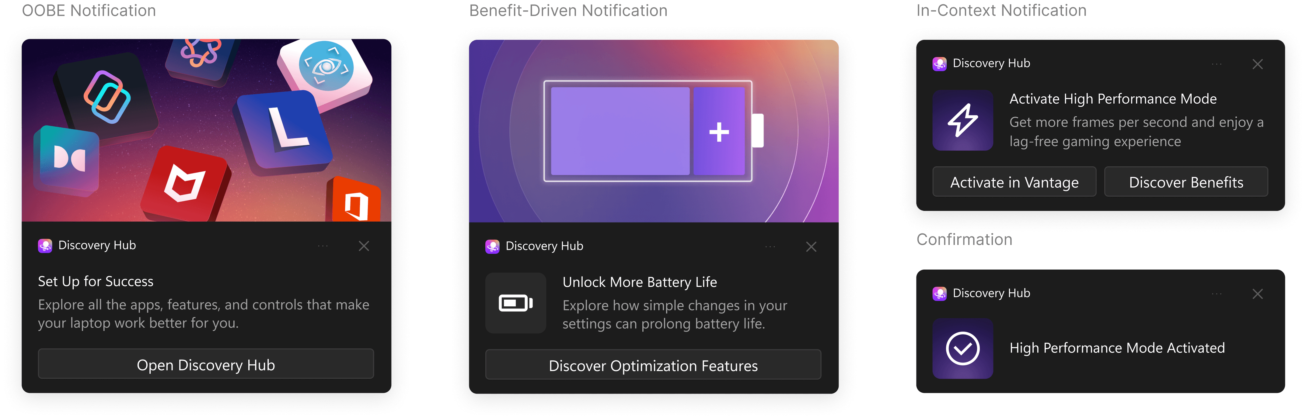
3 types of notification for different context
Moment 03
Staying inside
How to serve both new and returning users on one hub page?
I conducted research to learn what new and regular users want.
Research showed first-time and returning users had different priorities. New users gravitated toward the Day One Essentials. Returning users wanted popular recommendation.
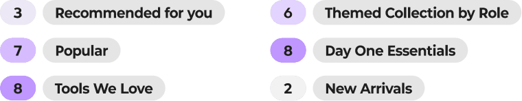
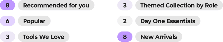
So I initially built 2 layouts

However, I needed to change it to the same layout due to the technical limitation.
After communicate with the dev team, I found out that the home page need to use the same layout for different users due to the limitation.
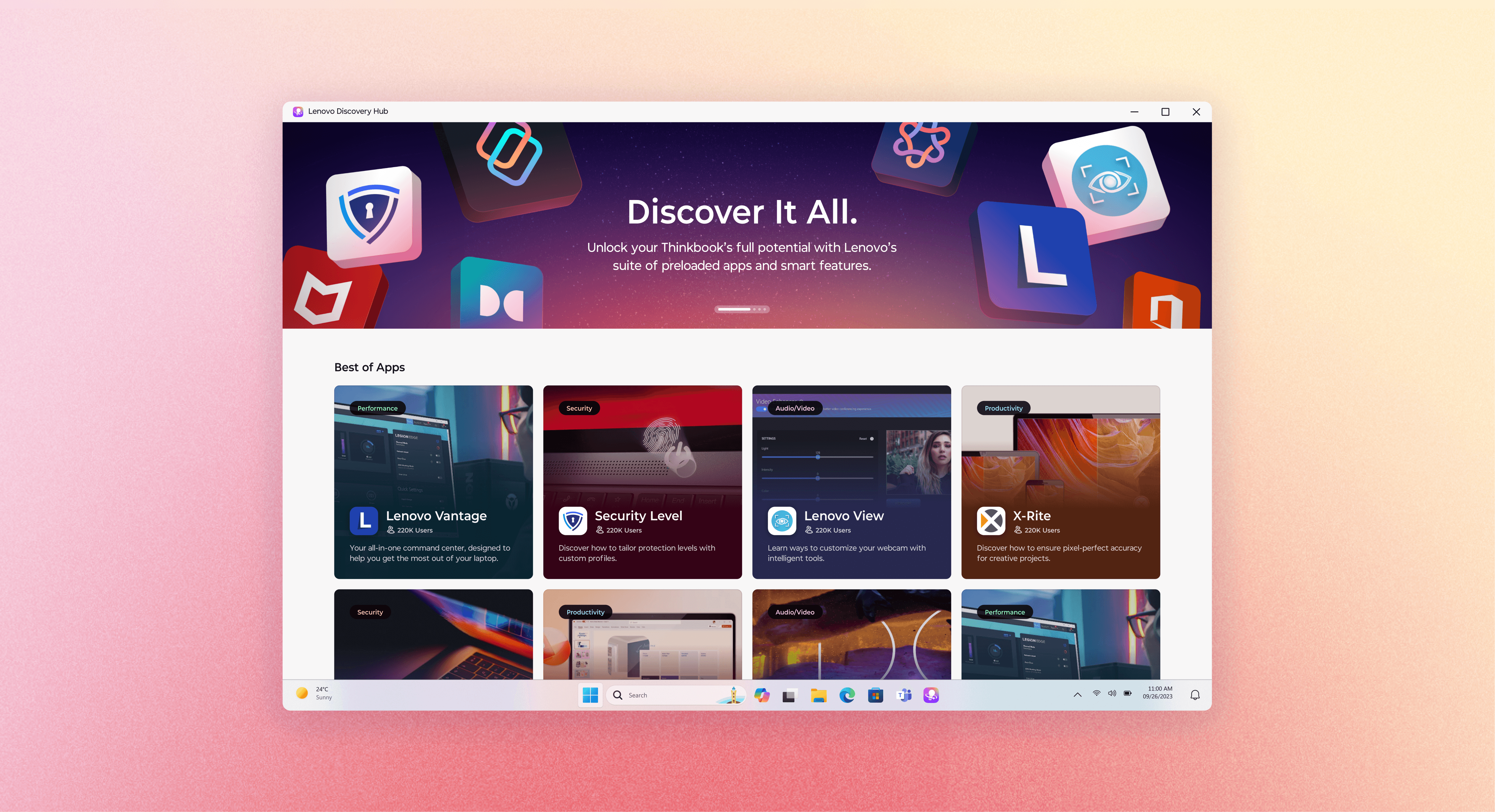
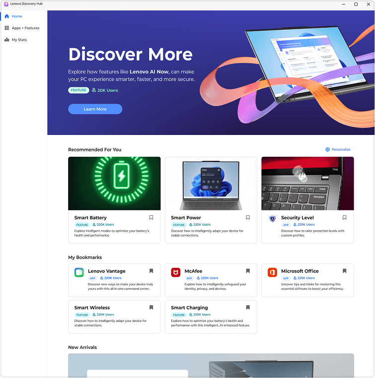
The soluion
Combine 2 sections to "Best of Apps"

Impact
Verifying Assumptions
It saves significant effort to verify assumptions before designing. Asking "why" early prevents costly rework and ensures the solution is grounded in reality rather than guesswork.
Adaptable Storytelling
Each audience needs a different story. It is essential to adapt the presentation approach to the audience, ensuring stakeholders see the vision while engineers understand the logic