Connection Point

Define a management & discovery desktop platform for a global technology company, to create a clear plugging and daily use experience of the hardware.

My Role

My Role

My Role

UIUX Design Intern

Responsibility

Responsibility

Responsibility

UIUX Design, Prototyping,

Team

Team

Team

Senior Designers, Product Managers, Engineers

Duration

Duration

Duration

2025/8-2025/9

3 weeks

The Mission

Design the Connection Point for Lenovo’s LTE hardware ecosystem, enabling users to quickly check connection status and seamlessly navigate to settings through intuitive interactions.

The Mission

Design the Connection Point for Lenovo’s LTE hardware ecosystem, enabling users to quickly check connection status and seamlessly navigate to settings through intuitive interactions.

The Impact

Create over 15 different states to cover all the usage cases

About to launch in 2026.

Designed 20+ screens for smooth handoff.

Delivered project mandate to client and dev team.

Product will be launched in 2026 October.

The Impact

Create over 15 different states to cover all the usage cases

About to launch in 2026.

Connection Point

Define a management & discovery desktop platform for a global technology company, to create a clear plugging and daily use experience of the hardware.

My Role

UIUX Design Intern

Responsibility

UIUX Design, Prototyping,

Team

Senior Designers, Product Managers, Engineers

Duration

2025/8-2025/9

3 weeks

The Mission

Design the Connection Point for Lenovo’s LTE hardware ecosystem, enabling users to quickly check connection status and seamlessly navigate to settings through intuitive interactions.

The Impact

Create over 15 different states to cover all the usage cases

About to launch in 2026.

The Outcome

The Outcome

The Outcome

The Outcome

LTE Track - Daily Use of the Connection Point

A dynamic and easy-to-use connection point.

LTE Track - Daily Use of the Connection Point

LTE Track - Daily Use of the Connection Point

A dynamic and easy-to-use connection point.

A dynamic and easy-to-use connection point.

The Process

The Process

The Process

The Process

The Process

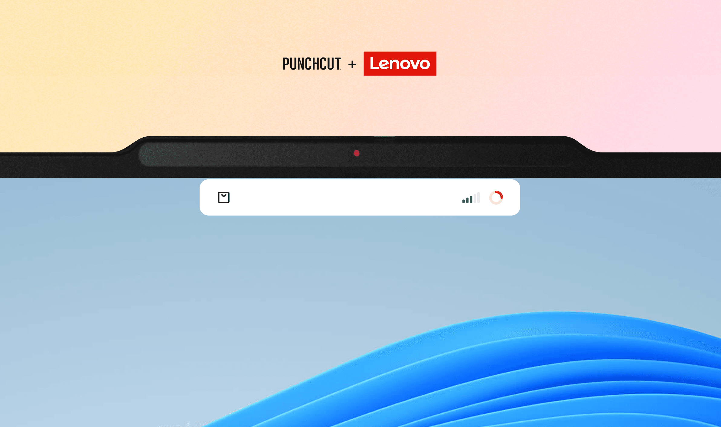
What is the connection point?

An element that shows device connection status and provides quick access to actions
  1. In Lenovo’s MagicBay ecosystem, shows hardware status through collapsed and hover states for quick visibility.

  2. In the LTE flow, it displays data usage status and provides an entry to purchase additional data.
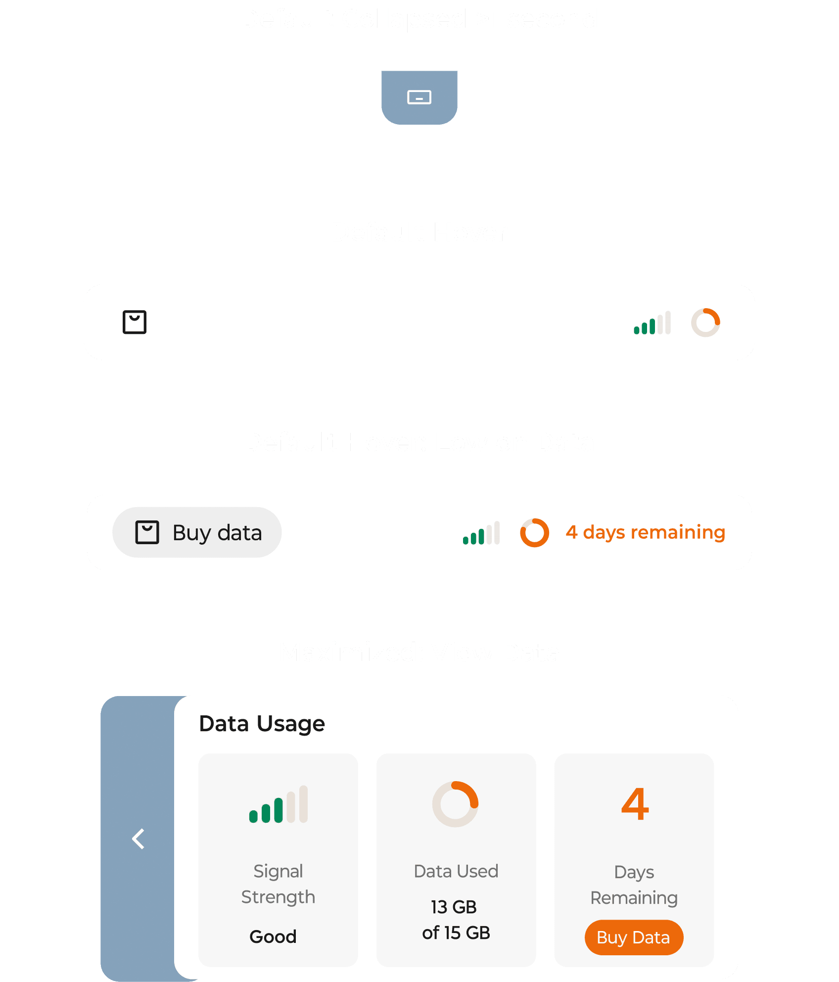
Current Problems

I have analyzed 4 key problems of the current connection point experience.

1

1

Oversized panel blocks the view and distracts users from the main interface.

2

2

Limited states fail to clearly communicate the connection status.

3

3

Data usage lacks real-time visualization, making patterns hard to understand.

4

4

Data plan purchase relies on pop-up windows, interrupting the user flow.

1

Oversized panel blocks the view and distracts users from the main interface.

2

Limited states fail to clearly communicate the connection status.

3

Data usage lacks real-time visualization, making patterns hard to understand.

4

Data plan purchase relies on pop-up windows, interrupting the user flow.

Opportunies

From there, I have set 4 design goals.

Minimize the mini window to reduce visual obstruction and distraction.

Show clear and sufficient connection status to increase clarity and user trust.

Visualize data usage patterns to help users understand their consumption.

Surface data plan options contextually without intrusive pop-ups.

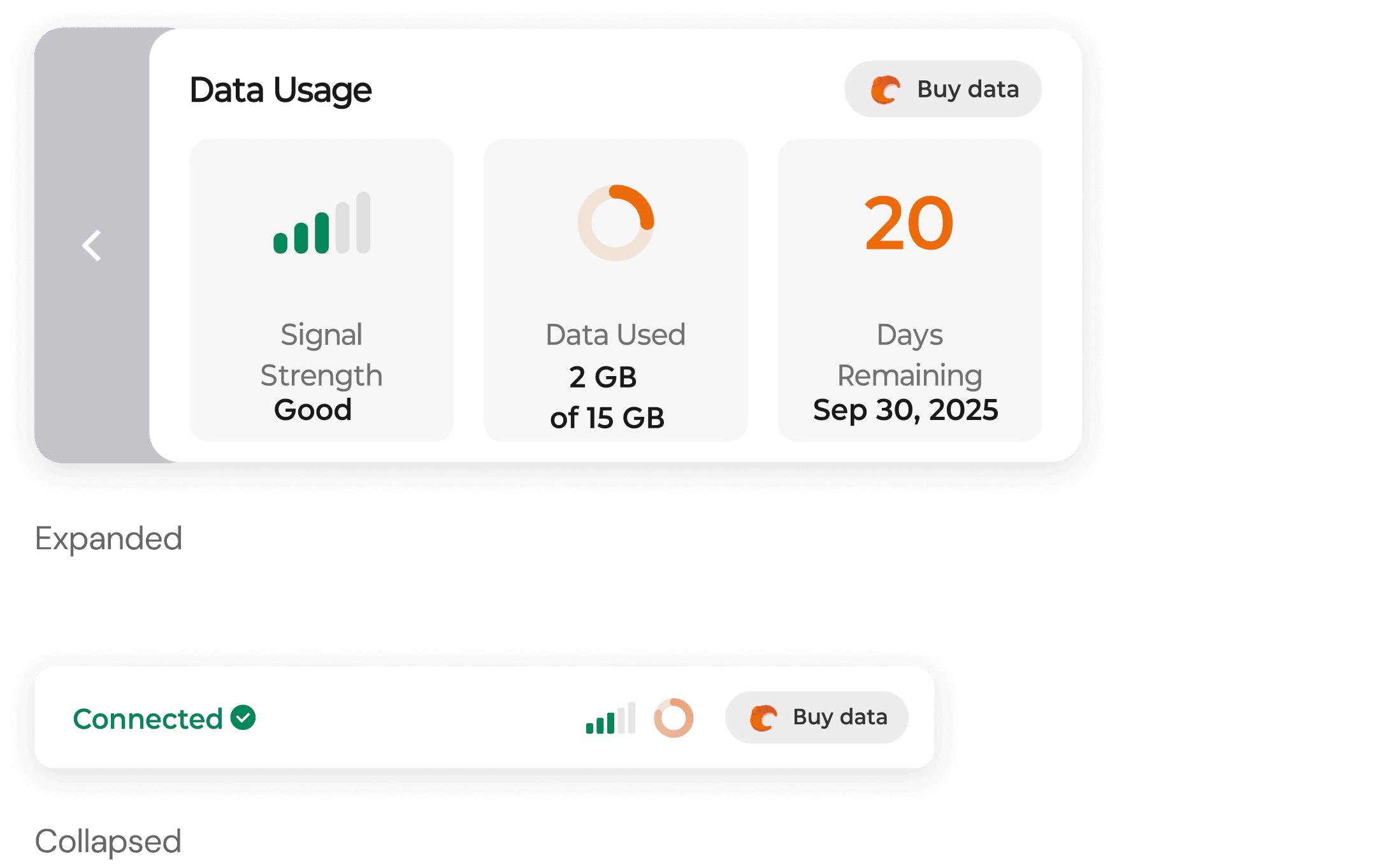
Deicision 01: Hover and Expand

Introduce responsive panel sizes to avoid blocking the screen by default, while revealing more information on hover when needed.

Information Architecture

I structured the IA using a dual-state approach—hover for quick actions, expanded for data-rich interaction to keep the workspace clean, transparent, and easy to navigate.

Decision 02: CTA

Add a CTA to shorten the path for purchasing data, while keeping the design minimal to avoid disrupting the daily user experience.

Layout Iteration

Before - Vertical Layout
After - Horizontal Layout

Limited information display; adding more content can make the panel size difficult to control.

Inefficient use of space in the expanded panel.

Free up space for clearer interaction and status details.

Improve alignment and structure of information in the expanded view.

CTA Iteration

Before - Vertical Layout
After - Horizontal Layout

Limited information display; adding more content can make the panel size difficult to control.

Inefficient use of space in the expanded panel.

Free up space for clearer interaction and status details.

Improve alignment and structure of information in the expanded view.

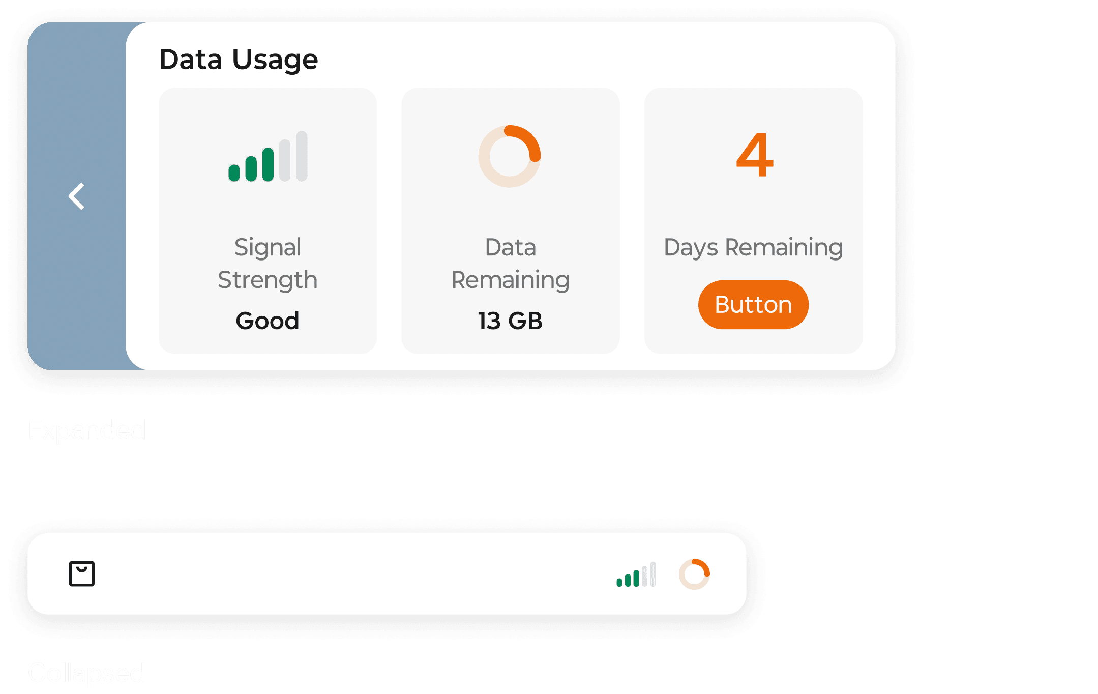
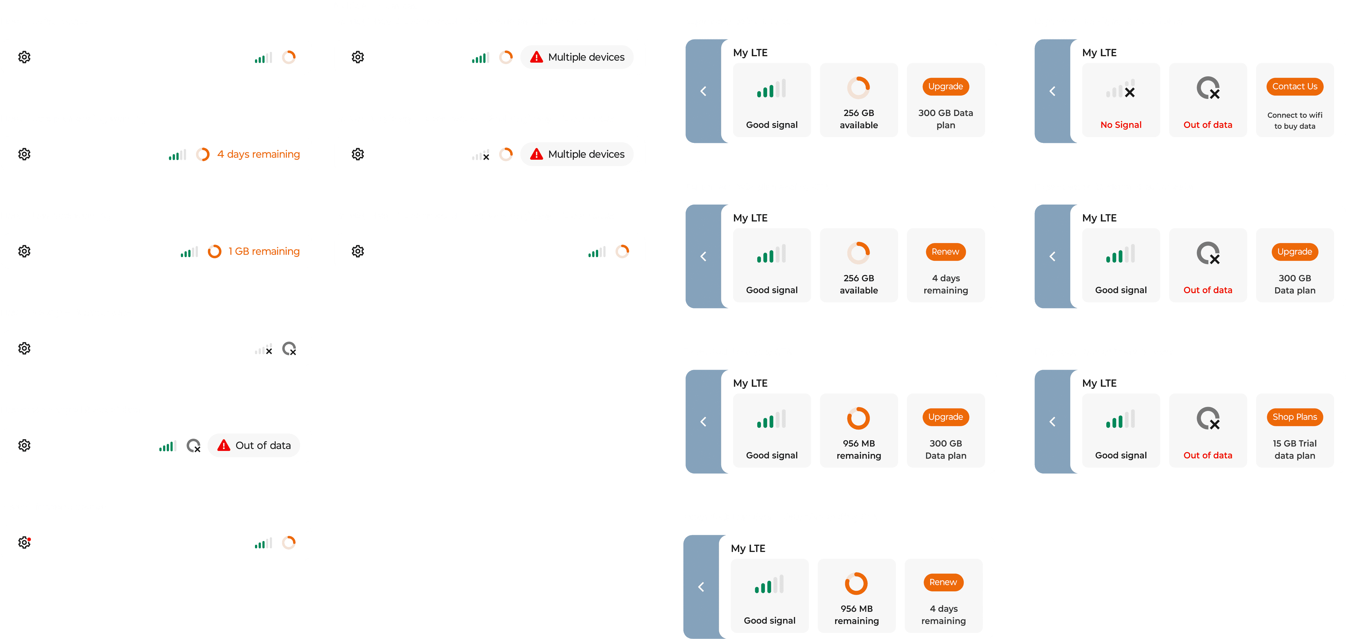
Decision 03: Hover states System

To clearly communicate connection status, I collaborated with designers to map out edge cases and define a scalable hover-state system. We established consistent status patterns that could accommodate multiple scenarios while remaining clear and easy to extend.

Takeaways

Takeaways

Takeaways

Takeaways

Takeaways

If I have more time

Introduce clearer usage analytics and trends to help users better understand and manage their LTE consumption.

I learned

Designing a persistent system element requires carefully balancing information clarity with minimal visual interruption to the workspace.